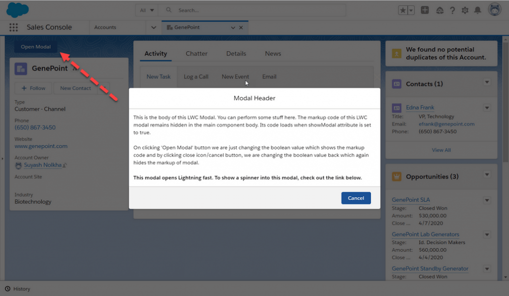
A modal window is a graphical control element subordinate to an application’s main window. It opens a small layer/window on top of the parent screen with a slight backdrop so that you can see the parent too. The advantage of this box is that you don’t need to navigate between pages, instead, change data in it close it and you are back on the parent screen. Creating Modal in LWC is very easy and just a task of minutes.
Modals/pop-ups can be created easily with few lines of code. There are various ways to create it. We will discuss one of the methods here.
Working Demo:
We will use a single component to show modal markup. A boolean variable will control the visibility of the modal.
Create the customModal lightning component.
For creating a new lightning web component, use the VS Code or other IDE.
Step-1: Open the customModal.html and paste the below code.
|
1 2 3 4 5 6 7 8 9 10 11 12 13 14 15 16 17 18 19 20 21 22 23 24 25 26 27 28 29 30 |
<template> <!-- Modal will open on click of this modal --> <lightning-button name="openModal" label="Open Modal" onclick={openModal} variant="brand" class="slds-m-around_small"></lightning-button> <!-- This Modal will only be visible if showModal is set to true --> <template if:true={showModal}> <section aria-modal="true" class="slds-modal slds-fade-in-open"> <div class="slds-modal__container "> <header class="slds-modal__header"> <h2 class="slds-text-heading_small">Modal Header</h2> <lightning-icon class="slds-modal__close" icon-name="utility:close" size="small" onclick={closeModal}></lightning-icon> </header> <div class="slds-modal__content"> <div class="slds-p-around_small"> <p>This is the body of this LWC Modal. You can perform some stuff here. The markup code of this LWC modal remains hidden in the main component body. Its code loads when showModal attribute is set to true.</p><br /> <p>On clicking 'Open Modal' button we are just changing the boolean value which shows the markup code and by clicking close icon/cancel button, we are changing the boolean value back which again hides the markup of modal.</p><br/> <p><b>This modal opens Lightning fast. To show a spinner into this modal, check out the link below.</b></p> </div> </div> <footer class="slds-modal__footer"> <lightning-button variant="brand" label="Cancel" onclick={closeModal} class="slds-p-around_x-small"></lightning-button> </footer> </div> </section> <div class="slds-backdrop slds-backdrop_open"></div> </template> </template> |
Step-2: Open the customModal.js-meta.xml and paste the below code.
|
1 2 3 4 5 6 7 8 9 10 11 12 13 14 15 16 17 18 |
import { LightningElement, track } from 'lwc'; export default class CustomModal extends LightningElement { @track showModal = false; openModal() { // Setting boolean variable to true, this will show the Modal this.showModal = true; } closeModal() { // Setting boolean variable to false, this will hide the Modal this.showModal = false; } } |
Step-3: Open the customModal.js and paste the below code.
|
1 2 3 4 5 6 7 8 9 10 11 12 |
<?xml version="1.0" encoding="UTF-8"?> <LightningComponentBundle xmlns="http://soap.sforce.com/2006/04/metadata"> <apiVersion>50.0</apiVersion> <isExposed>true</isExposed> <targets> <target>lightning__AppPage</target> <target>lightning__RecordPage</target> <target>lightning__HomePage</target> </targets> </LightningComponentBundle> |
We used standard SLDS (Salesforce Lightning Design System) to give styling to our component. You can find it here SLDS.
Step-3: Call the LightningModal component in the lightning app.
|
1 2 3 4 5 |
<aura:application extends="force:slds"> <c:customModal></c:customModal> </aura:application> |
Also Check:
For any queries or suggestions regarding this post, comment below:
Cheers … 🙂


