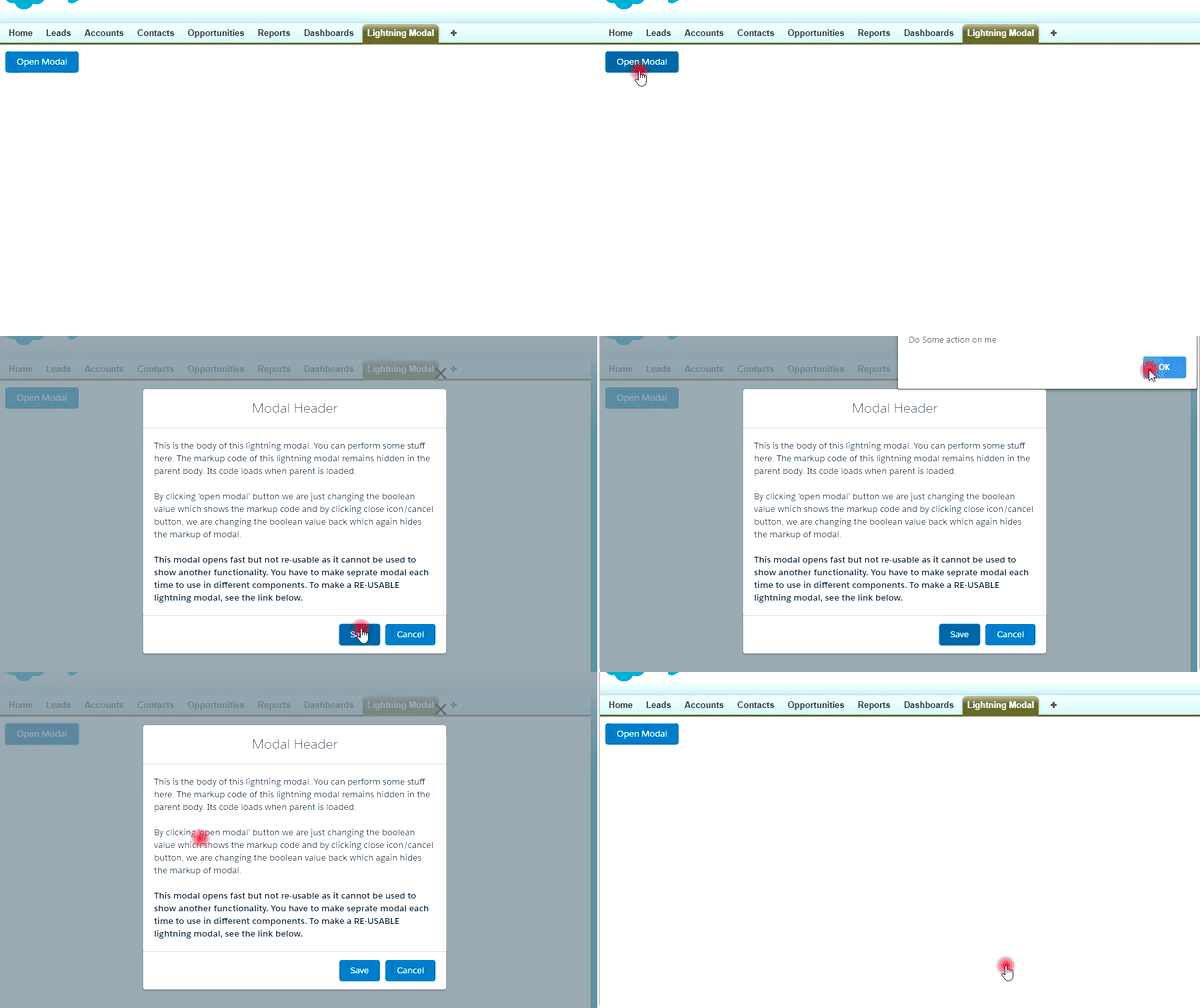
So what exactly a modal is ???
A modal window is a graphical control element subordinate to an application’s main window. It opens a small layer/window on top of the parent screen with a slight backdrop so that you can see the parent too. The advantage of this box is that you don’t need to navigate between pages, instead, change data in it close it and you are back on parent screen.
Modals/pop-ups can be created easily with few lines of code. There are various ways to create it. We will discuss one of the methods here.
Working Demo:

Method-1: Create Modal Box within a single component
We will use a single component to show parent and child markup.
Create the LightningModal lightning component.
For creating a new lightning component navigate to Developer Console > File > New > Lightning Component
Enter Name & Description and click Submit. Now component markup file will open by default. In the right sidebar, click on Controller to create it.
Step-1: Open the LightningModal.cmp and paste the below code.
|
1 2 3 4 5 6 7 8 9 10 11 12 13 14 15 16 17 18 19 20 21 22 23 24 25 26 27 28 29 30 31 32 33 34 35 |
<aura:component > <!-- Boolean attribute to open/close the modal --> <aura:attribute name="openModal" type="Boolean" default="false" /> <!-- utton to open the modal --> <lightning:button variant="brand" label="Open Modal" title="Open Modal" onclick="{! c.openModal }" /> <!-- Here we wrapped our modal code inside aura:if. If it evaluates true, code inside it will be visible --> <aura:if isTrue="{!v.openModal}" > <div class="demo-only" style="height: 600px;"> <section role="dialog" tabindex="-1" aria-labelledby="modal-heading-01" aria-modal="true" aria-describedby="modal-content-id-1" class="slds-modal slds-fade-in-open"> <div class="slds-modal__container"> <!-- Header of Modal --> <header class="slds-modal__header"> <lightning:buttonIcon iconName="utility:close" class="slds-modal__close" size="large" variant="bare" alternativeText="Close" onclick="{! c.closeModal }"/> <h2 id="modal-heading-01" class="slds-text-heading_medium slds-hyphenate">Modal Header</h2> </header> <!-- Body of Modal --> <div class="slds-modal__content slds-p-around_medium" id="modal-content-id-1"> <p>This is the body of this lightning modal. You can perform some stuff here. The markup code of this lightning modal remains hidden in the parent body. Its code loads when parent is loaded.</p><br /> <p>By clicking 'open modal' button we are just changing the boolean value which shows the markup code and by clicking close icon/cancel button, we are changing the boolean value back which again hides the markup of modal.</p><br/> <p><b>This modal opens fast but not re-usable as it cannot be used to show another functionality. You have to make seprate modal each time to use in different components. To make a RE-USABLE lightning modal, see the link below.</b></p> </div> <!-- Footer of Modal --> <footer class="slds-modal__footer"> <lightning:button variant="brand" label="Save" title="Save" onclick="{! c.handleSave }" /> <lightning:button variant="brand" label="Cancel" title="Cancel" onclick="{! c.closeModal }" /> </footer> </div> </section> <!-- Backdrop to set background slightly opaque. --> <div class="slds-backdrop slds-backdrop_open"></div> </div> </aura:if> </aura:component> |
Step-2: Open the LightningModalController.js and paste the below code.
|
1 2 3 4 5 6 7 8 9 10 11 12 13 14 15 16 17 |
({ openModal : function(component, event, helper) { component.set('v.openModal',true); }, closeModal : function(component, event, helper) { component.set('v.openModal',false); }, handleSave : function(component, event, helper) { //Handle the action when save button is clicked you can write your custom logic here. alert('Do Some action on me'); component.set('v.openModal',false); } }) |
We used standard SLDS (Salesforce Lightning Design System) to give styling to our component. You can find it here SLDS.
Step-3: Call the LightningModal component in the lightning app.
|
1 2 3 4 5 |
<aura:application extends="force:slds" access="global"> <c:LightningModal /> </aura:application> |
So our component is ready to use but wait can you use this component in future if you want to create a Popup again?
Ummmm… Definitely not, the whole code is present in parent body so we cannot use this in general. To make a general component which can be used across all components see below post.
Method-2: Create Modal Box by the Dynamic component creation
Create Modal using Dynamic component creation
Method-3: Create Modal Box using Aura:method
Create Modal and use it by aura:method

Comment below and let me know if you have any issues/query.
Cheers :)…


